Tyrrells Building Advisory provide consulting and reporting services for a range of building situations including pre-purchase, dilapidation and quality assurance.
Having been in business for over 30 years, they decided it was time to pivot – new focus, new name and new branding.
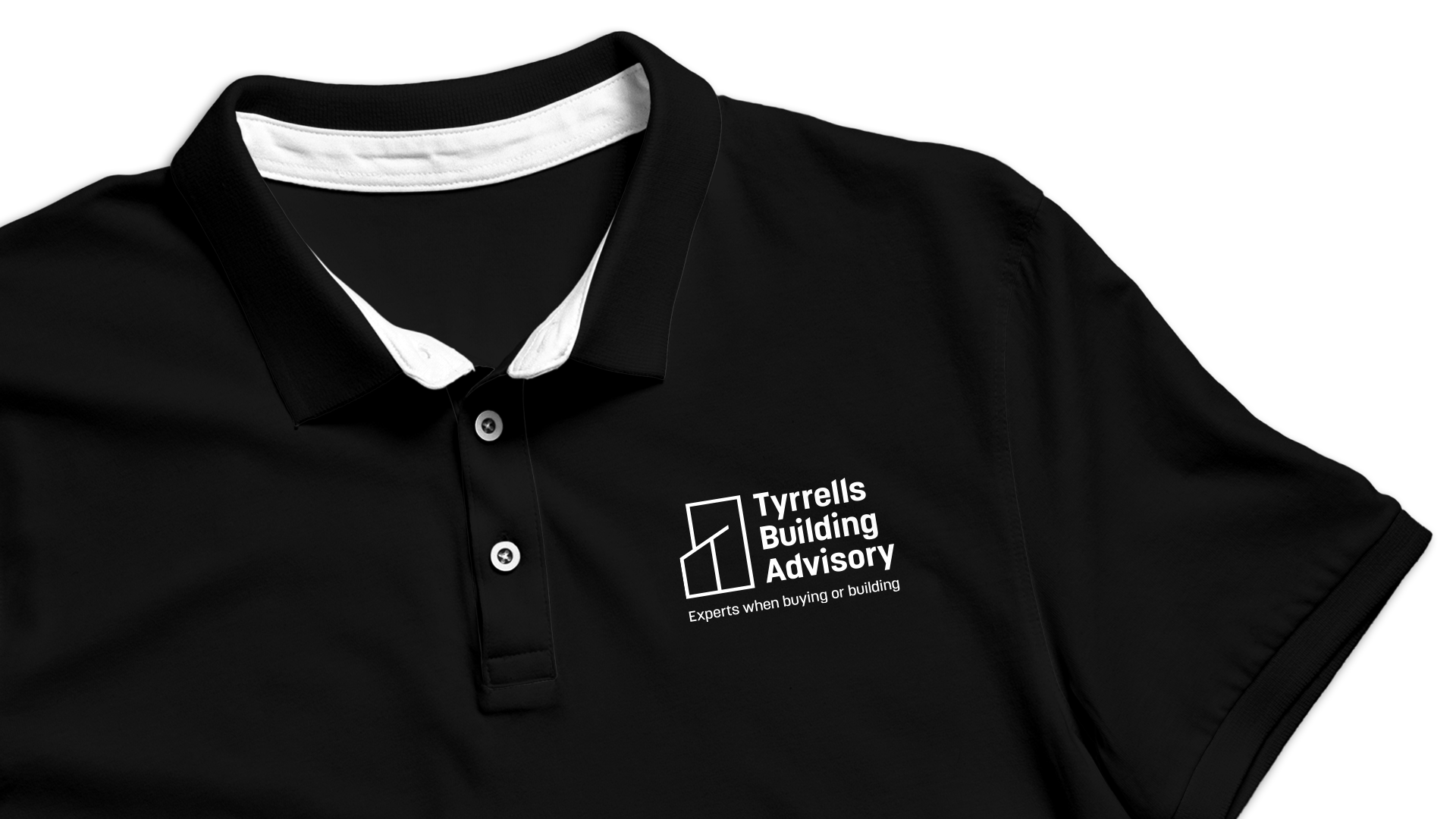
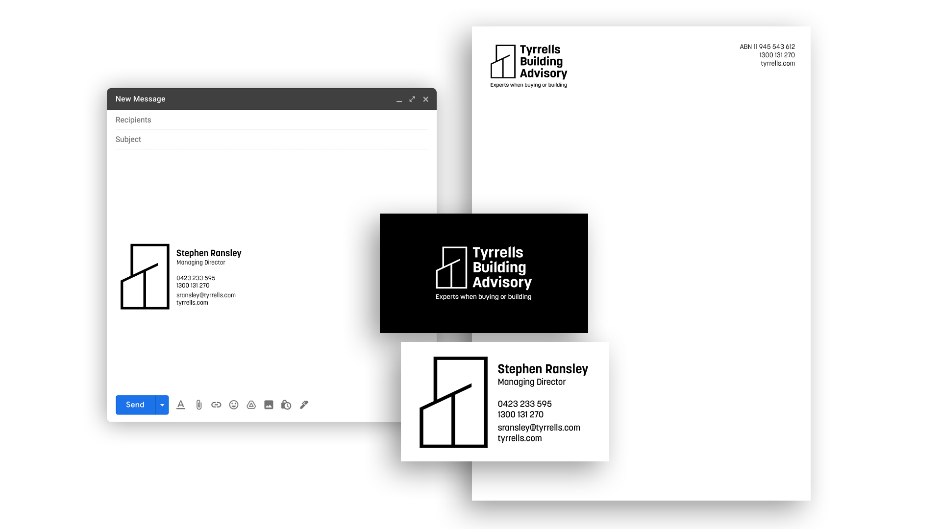
Their previous logo showcased the range of services through showing the different kinds of buildings – residential, commercial and high-rise. We refined this idea into one symbol, creating a shape which could be interpreted as a range of building types, and also incorporates a ‘T’ for Tyrrells.
CLIENT
Tyrrells Building Advisory
SERVICE
Branding
Branding